Beli Löw

As german speaking leading Notion consulting agency, we’re spending quite some time in meetings—from discovery calls to training sessions. With Notion Charts, analyzing which team members or departments spend the most time in meetings is straightforward and easy for every team member to understand. This is just one of many ways you can use charts for your business.
The Struggle 😅
Our main example are meetings, with stats you can make a good analizys of them, for example sometimes I find myself involved in a lot of meetings and that helped me realize I need to hire an additional consultant wich is working awesome, also I can see how much our business is growing and that’s super cool 😎
I’m a big fan of Notion charts, cause they can be easily added to any database you create or already have, here I’ll show you some potential applications for analysis and also my most used ones.
Bar Charts
Bar charts are perfect for comparing values across different categories, making them ideal for data visualization. They can effectively show the relationship between different items and their corresponding values. There are two main types you can use in Notion:
Vertical Bars
This is a clear example of the volume of discovery calls we’ve had since we started, pretty awesome right?

Horizontal Bars
Another useful application: you can visualize and analyze your business's financial performance through revenue breakdowns and trends.

Line Charts
Line charts are perfect for visualizing trends over time. They effectively show how data changes across different periods, making them ideal for tracking metrics like monthly revenue, user engagement, or project progress.
Here's a quick example: you can visualize and analyze your business's financial performance through detailed revenue breakdowns and trends.

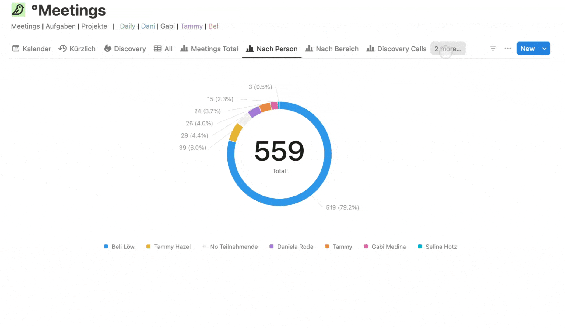
Pie Charts or Donut Charts
Shows proportions of a whole by dividing data into segments. Perfect for visualizing how different parts contribute to the total, like budget allocation, time distribution, or task completion rates. Each slice represents a percentage, making it easy to spot dominant categories at a glance.Ex:
→ Here we have meetings completed by person or team member. 🤩


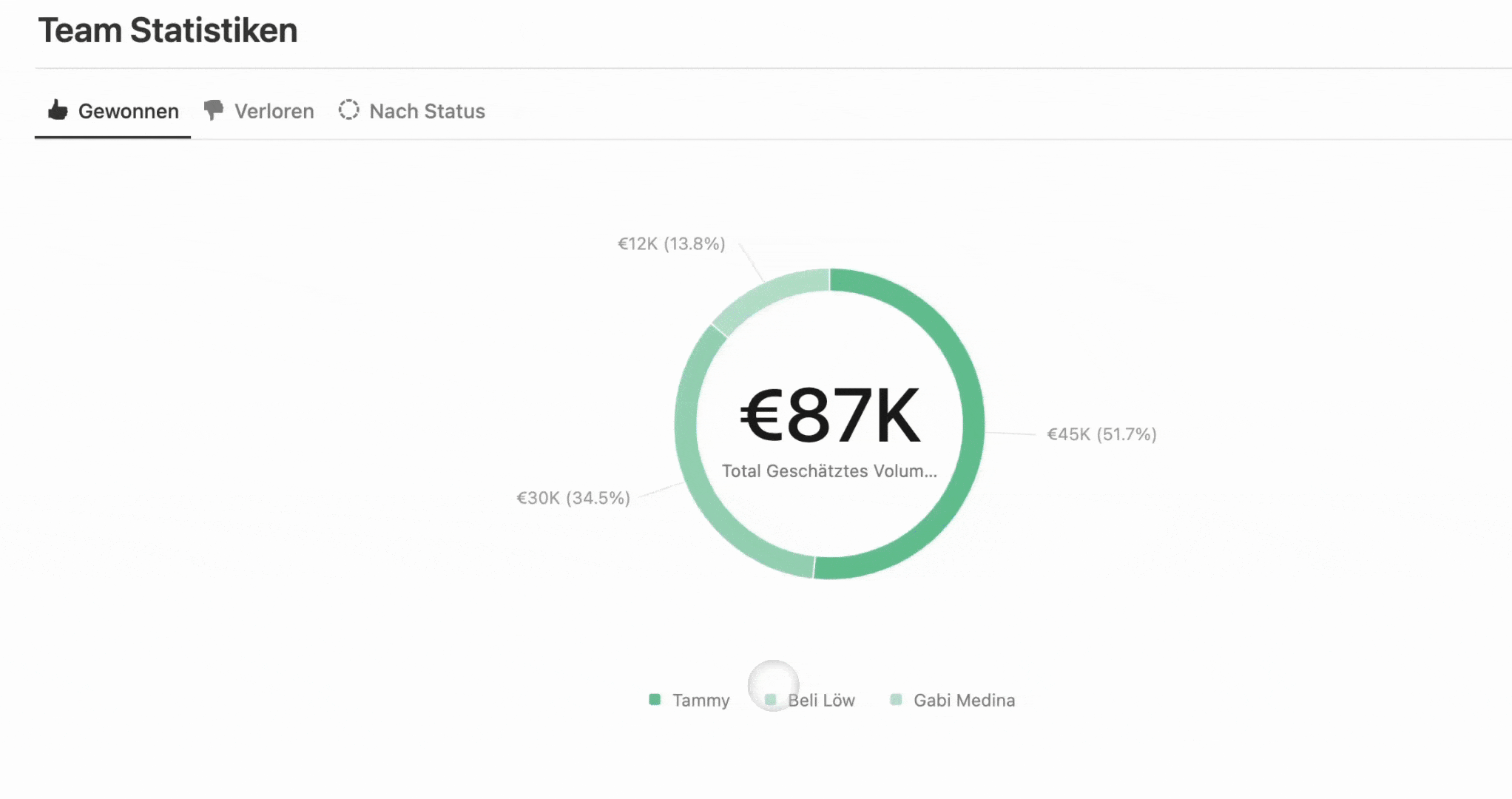
Tracking Expenses Made Easy
Here's a quick example from one of our financial templates that gives you a clear view of where your money is going.

- Add a new view to your data base and
click on Chart - Edit the view according your needs, in this case we wanted to show meetings per person.
- Choose the charts that fits your need, Notion offers several, and that’s it! 🤩
Cool New Feature - Get Even More Insights 🔥
In March 2025, Notion launched a new feature that lets you click on charts to view the filtered data. If you hover over any part of a chart, there's a new option: click to view data. This shows you a filtered list of all entries related to that segment. The best part is that you can add additional features to the automatically generated ones, search for specific entries, save it as a view, or go straight to the main database! 🤩
We have another awesome article, make sure you take a look at it 😉
FAQ


Beli Löw
Founder, Senior Notion Consultant
Beli is an IT project manager, tool enthusiast, entrepreneur and has organized his whole life with Notion. His news sources are release notes from tools. There is (almost) no feature or shortcut that he does not know.

Level Up Your Business Workspace: Get Monthly Notion Pro Tips
Keep Reading…


![Checkin Method [including Checkin questions generator]](https://images.spr.so/cdn-cgi/imagedelivery/j42No7y-dcokJuNgXeA0ig/89bbf513-5d6a-417a-8c66-a37447976918/Chekin-Tool/w=1920,quality=90,fit=scale-down)


